Here are my favorite serif fonts from Adobe. I looked through all the fonts in this category. All 348 of them. Save yourself some work and check out my suggestions.
- https://fonts.adobe.com/fonts/ambroise
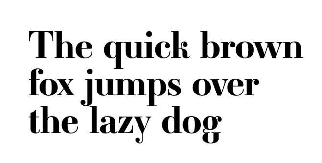
It has a has a classic look with some modern flair. There are great variations in there too. - https://fonts.adobe.com/fonts/mrs-eaves
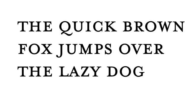
I love the wide proportions and airy feel of this one. - https://fonts.adobe.com/fonts/kopius
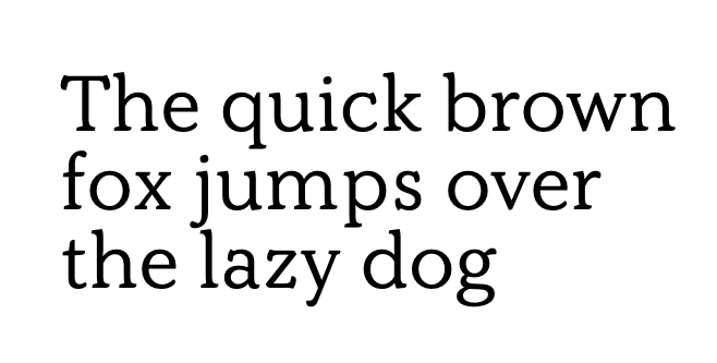
Kopius looks really sharp at smaller sizes and used as body copy. It’s really legible and has modern proportions. - https://fonts.adobe.com/fonts/eloquent-jf
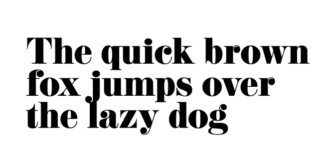
Big, bold, curvy. - https://fonts.adobe.com/fonts/gin
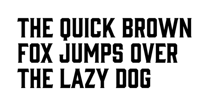
Gin is definitely a bold choice. I really like the edge and presence it has, especially at larger sizes. - https://fonts.adobe.com/fonts/colt-soft
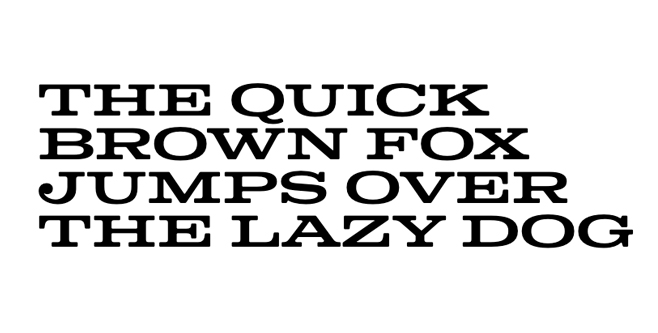
This one gives me cowboy vibes, but I love the width and shape of the letterforms. I believe it can be used in non-cowboy ways if you go big with it. - https://fonts.adobe.com/fonts/copperplate
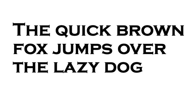
A bit goth, a bit edgy, Copperplate won’t work for everyone; I suggest pairing it with softer design elements to contrast the sharpness of the font. - https://fonts.adobe.com/fonts/temeraire
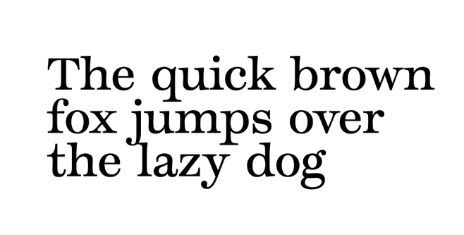
It’s soft and has a lot of character. Pair that with some beautiful serifs and you have yourself Temeraire. - https://fonts.adobe.com/fonts/sybarite
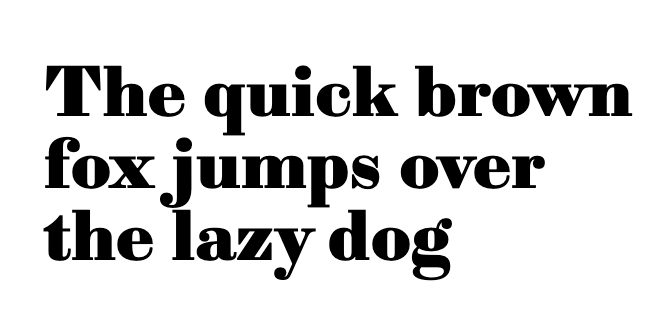
I love how angular and modern this font feels. - https://fonts.adobe.com/fonts/shackleton
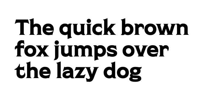
Here’s another with some edge. I will work well at large sizes where you can appreciate the edge and not be intimidated by it. - https://fonts.adobe.com/fonts/delicato
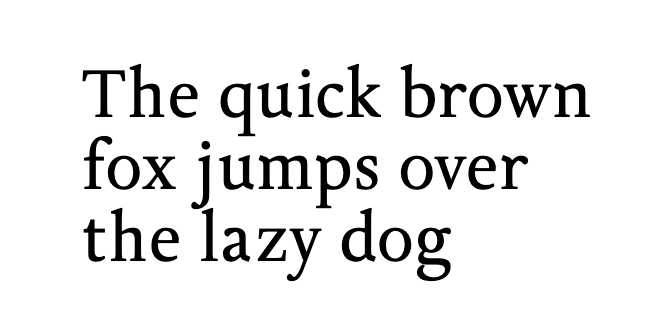
A solid, all-round good font that will work for most projects. - https://fonts.adobe.com/fonts/bookmania
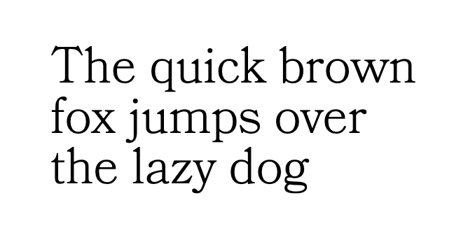
I love this as bold headlines, but it’s also great as body copy.


